
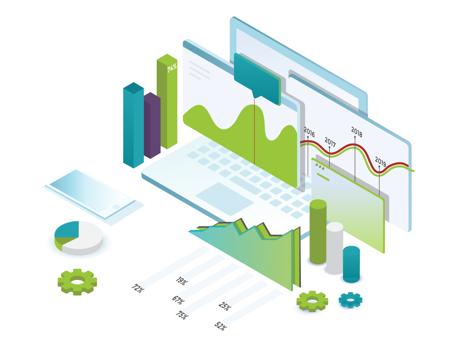
Data analytics play a key role in ESG efforts, as they help us see how our business and internal processes work, how we communicate our sustainability achievements transparently and in a data-driven manner. However, for ESG reporting, it is crucial not only to collect data but also to present data in the right way. It is where data visualisation can help decision-makers see the connections between data more quickly and make business decisions based on that data.

ESG is an EU directive that encourages small, medium and large enterprises to develop a corporate ecosystem that supports the transition to green energy, promotes social responsibility and ensures transparent corporate governance processes for employees and other stakeholders. Under the European Union's Non-Financial Reporting Directive (NFRD), all large listed companies, banks and companies with more than 500 employees are required to report since 2018. From 2024, the Corporate Sustainability Reporting Directive (CSRD) will come into force, covering an additional 50,000 European companies, extending the reporting obligation. This will make companies more transparent about their environmental impact and financial performance, particularly in relation to green, sustainable initiatives.
|
|
|
Environmental data is essential for companies to assess their ecological footprint and develop more efficient practices. Accurate measurement of environmental impacts enables companies to identify opportunities for improvement in sustainability areas and value-creating solutions. With environmental data, companies can determine how they should adapt their business processes and operations to reduce their ecological footprint while maximising their positive impact on the environment.
Social indicators, such as workforce diversity and respect for human rights, are key to corporate social responsibility efforts. These data are not only statistical information, but also define a company's ethical values and social commitment. Data on workforce diversity reflect a company's commitment to creating an inclusive work environment, while human rights indicators demonstrate a company's commitment to ethical business practices. Such data dispel uncertainty among stakeholders, enhance the credibility of the company and foster mutual trust between society and the company.
Data on corporate governance shows the management structure, details decision-making processes and reveals corporate values. With this information, companies create transparency in the management hierarchy and present a more transparent strategy to stakeholders. The presentation of the management structure and decision-making processes enhances the credibility and accountability of companies, while supporting the development of effective corporate governance. Corporate governance data helps stakeholders, including investors and shareholders, to better understand corporate operations and decisions, fostering trust and long-term success.
In the area of comparative analysis, data visualisation helps to compare ESG indicators across different time periods, business units and industry benchmarks. Visualisation tools help companies to easily see how their sustainability performance compares to their competitors, for example.
Interactive dashboards and reports enable real-time data monitoring, giving managers and stakeholders instant access to the latest ESG data, providing a real-time view of a company's ESG performance. This data provides important information not only to internal decision makers, but also to external stakeholders (e.g. shareholders, supervisory board). Real-time dashboards increase transparency in the company's operations.
|
Don't miss the latest news, blog posts
|

Geopositional visualisation of environmental impacts is a powerful tool for companies, as it maps the environmental footprint of their operations. It gives companies a detailed and spatial overview of the areas where the environmental impacts of their operations are most significant. Geopositional visualisation allows companies to easily identify sensitive areas where environmental challenges or sustainability concerns require priority attention.
Ensuring data quality is key to effective and reliable business decisions. Visualisation enables data quality to be monitored and improved. Interactive graphs and charts allow users to easily spot any anomalies or gaps in the data. In addition, dynamic visualisation contributes to data cleansing processes.

Read On
- SOFTWARE DEVELOPMENT
- BUSINESS INTELLIGENCE
- POWER BI
What is the difference between Business Intelligence and Reporting?
We often mean the same for reporting and business intelligence as they help businesses analyze their performance based on Big Data, but they belong to distinct usages. The risk of not identifying the differences may result in using the wrong tools for the given task.

- BUSINESS INTELLIGENCE
- BI
Data visualization trends in business intelligence: A broad overview from chart types to tech directions
Data visualization is essential to business intelligence as graphically illustrated large datasets help analysts have a deeper, more comprehensive understanding of incoming data in a shorter period. To visualize trends and represent numerical insights effectively, analysts have to select the proper...

- BUSINESS INTELLIGENCE
- BI
The value of business intelligence for every organization
The rapid growth of new technologies and innovations make the global market even more competitive, and to remain visible, businesses must use ingenious tactics. Companies must develop methods to understand and take ownership of Big Data to stay relevant in a given market segment. Business...


