
Data visualization is essential to business intelligence as graphically illustrated large datasets help analysts have a deeper, more comprehensive understanding of incoming data in a shorter period. To visualize trends and represent numerical insights effectively, analysts have to select the proper form of data visualization. 
The primary goal of business intelligence is collecting and transforming data into actionable insights that serve operational and strategic purposes, facilitating informed decision-making. Business intelligence refines raw data into useful information, through this meticulous collection, businesses gain a competitive edge by unravelling patterns that fuel innovation and growth, fostering an agile environment where insights steer strategies and success.

Once organizations have collected, refined, and structured their business data, they realize the necessity to ensure analysts and decision-makers have multiple ways to understand and delve into this data without requiring specialized technical knowledge. In business intelligence, data visualization refers to the strategic utilization of graphical techniques to manifest data and insights lucidly and perceptively. It utilizes diverse visual elements, like charts, graphs, maps, and others, to encapsulate intricate datasets in formats that facilitate facile comprehension and interpretation. The efficiency of this visual representation is evidenced in its ability to accentuate trends, patterns, and correlations inherent within the data, thereby expediting the assimilation of actionable insights by decision-makers.

Common types of data visualizations
Data visualization is central to business intelligence (BI), swiftly conveying complex information and enabling insightful conclusions. Bar charts compare categories via proportional bars, while line charts track time-based trends. Pie charts depict proportions, scatter plots unveil relationships, and area charts display cumulative patterns. Heatmaps indicate data density through colours, and histograms reveal value distribution. These techniques empower BI experts to convey insights effectively, guiding strategic decisions and enhancing business comprehension. This blog post will examine the top 5 chart types beyond listing all.

Bar Charts
Bar charts are fundamental and efficient tools for visually presenting complex data in an easily comprehensible manner. Using proportional rectangular bars, they swiftly allow for comparison across categories or groups, enabling quick identification of trends and discrepancies. Their strength lies in distilling intricate datasets into clear insights, making them invaluable for decision-makers. By emphasizing value differences, they enhance understanding and reveal significant variations, aiding in outlier identification. Versatile across various data types, bar charts are essential in business intelligence reports, dashboards, and presentations, bridging raw data and actionable insights to facilitate well-informed decisions and strategic success.

Pie charts
Pie charts, a pivotal tool within the spectrum of data visualization strategies for business intelligence, deliver a succinct portrayal of categorical data's proportional distribution. By partitioning a unified whole into segments akin to pie slices, each piece's size mirrors the corresponding category's relative contribution. Although they proficiently depict component portions of a whole, pie charts mainly shine in illustrating proportions and percentages, significantly facilitating immediate comprehension. Nevertheless, the judicious application of pie charts is imperative due to the challenge of accurately comparing slice sizes, especially when dealing with numerous categories. When strategically incorporated, pie charts swiftly furnish an intuitive visual grasp of data distribution, amplifying the ability to make informed decisions within the business intelligence domain.
|
Subscribe to our newsletter and never miss a thing
|


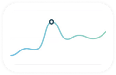
Line charts
Line charts are essential as they adeptly depict trends and temporal dynamics inherent in data. By establishing connections among data points through lines, they offer a dynamic visualization that captures the evolution of values over time. This quality makes them indispensable for monitoring continuous data like sales figures, stock prices, and performance metrics. The agility with which line charts communicate evolving patterns and fluctuations empowers decision-makers to extract insights swiftly, facilitating agile responses to the ever-changing contours of the market. Ultimately, line charts emerge as a cornerstone tool for unearthing temporal relationships, augmenting the analytical toolkit within business intelligence and elevating the calibre of informed decision-making processes.

Radar or spider chart
Embedded within the tapestry of business intelligence data visualization, the radar or spider chart emerges as a distinct and potent tool. This chart articulates multivariate data intricacies by unfurling variables as spokes radiating from a central nucleus. This ingenious design bestows a panoramic view of data distribution across diverse dimensions, conferring value in concurrently comparing multiple metrics. Each variable's amplitude, as it extends from the core, expedites the appraisal of dataset strengths and frailties. As a comprehensive visual digest of intricate datasets, the radar chart engenders perspicacious pattern discernment, underpinning strategic decision-making through its holistic perspective on the multidimensional interplay of data dynamics within the business intelligence expanse.

Funnel charts
The funnel chart is essential by providing a potent depiction of data's progression across stages or categories. With an architecture resembling an inverted pyramid, it masterfully portrays the diminishing data volume as it traverses through a sequential continuum. This distinctive design proves particularly efficacious in conveying conversion rates, spotlighting bottlenecks, and pinpointing domains ripe for optimization. As it unfurls a visual narrative of the funnelling phenomenon, this chart emerges as a guiding beacon for decision-makers, offering insights to streamline workflows, elevate customer journeys, and optimize the allocation of resources. Its contribution is a linchpin in ushering data-centric insights and steering strategic manoeuvres across the intricate terrain of business intelligence.

Area charts
In parallel with line charts, the area chart delineates its uniqueness by occupying space beneath the line, resulting in a visually compelling portrayal of cumulative data patterns across temporal progressions or categorical domains. The area chart proficiently captures the fluidity of changing data dynamics, enabling decision-makers to discern shifts and undulations. Its visual depth and detail facilitate the recognition of intensifying or waning trends, thereby nurturing the grounds for astute decision-making and strategic blueprinting within the intricate canvas of the business intelligence spectrum.
Contemporary trends in data visualization are prominently characterized by a focus on expeditious automation, intuitive user experiences, optimal performance, and the art of narrative storytelling. These trends are seamlessly incorporated into the base of modern BI tools, infusing novel dimensions into conventional strategies. Let us delve into this evolution.
Augmented analytics (AA), a popular trend spanning several years, brings advancements and automation facilitated through sophisticated Machine Learning (ML) algorithms. AA technologies enable users to explore and interact with data in three-dimensional spaces, providing deeper insights and more engaging presentations.
Natural Language Processing (NLP) is an essential element within augmented analytics, a potent tool for accessing data more aligned with human communication than conventional coding queries or module manipulation processes. Combining NLP with augmented analytics allows users to interface with databases and formulate queries using natural language.
We cannot better emphasize the significance of data scalability in data visualization. As datasets burgeon in complexity and volume, the ability of visualization tools to accommodate and effectively represent this expanding data landscape becomes paramount. Scalability ensures that visualizations remain responsive and insightful even as data grows exponentially. It empowers organizations to handle larger datasets without sacrificing performance, enabling seamless data exploration and interpretation across various dimensions.
Moreover, as businesses strive to glean insights from diverse sources, including real-time data streams and historical archives, scalable data visualization paves the way for agile decision-making by incorporating new information into existing visual frameworks. Ultimately, data scalability in data visualization fortifies the foundation of business intelligence, enabling organizations to extract meaningful insights from their ever-evolving data reservoirs and empowering strategic actions.
Read On

- BUSINESS INTELLIGENCE
- ESG
The importance of data visualisation in ESG reports
Data analytics play a key role in ESG efforts, as they help us see how our business and internal processes work, how we communicate our sustainability achievements transparently and in a data-driven manner. However, for ESG reporting, it is crucial not only to collect data but also to present data...

- SOFTWARE DEVELOPMENT
- BUSINESS INTELLIGENCE
- POWER BI
What is the difference between Business Intelligence and Reporting?
We often mean the same for reporting and business intelligence as they help businesses analyze their performance based on Big Data, but they belong to distinct usages. The risk of not identifying the differences may result in using the wrong tools for the given task.

- E-MOBILITY
- ELECTRIC VEHICLES
- ELECTRIC CHARGING
- SMART CITIES
Europe is set to become the global electric vehicle market leader by 2030
Analysts foresee that European Union countries will overtake China and USA in case of the highest rate of selling electric vehicles in the next few years. The European Parliament and European Council set an agreement in June 2022 that all new cars registered in Europe will have zero-emission by...


